Imagine us curled up with mismatched mugs, spilling truths over imperfect resumes—because that’s how real growth happens.
1. Why templates matter—but don’t let ‘em boss you around
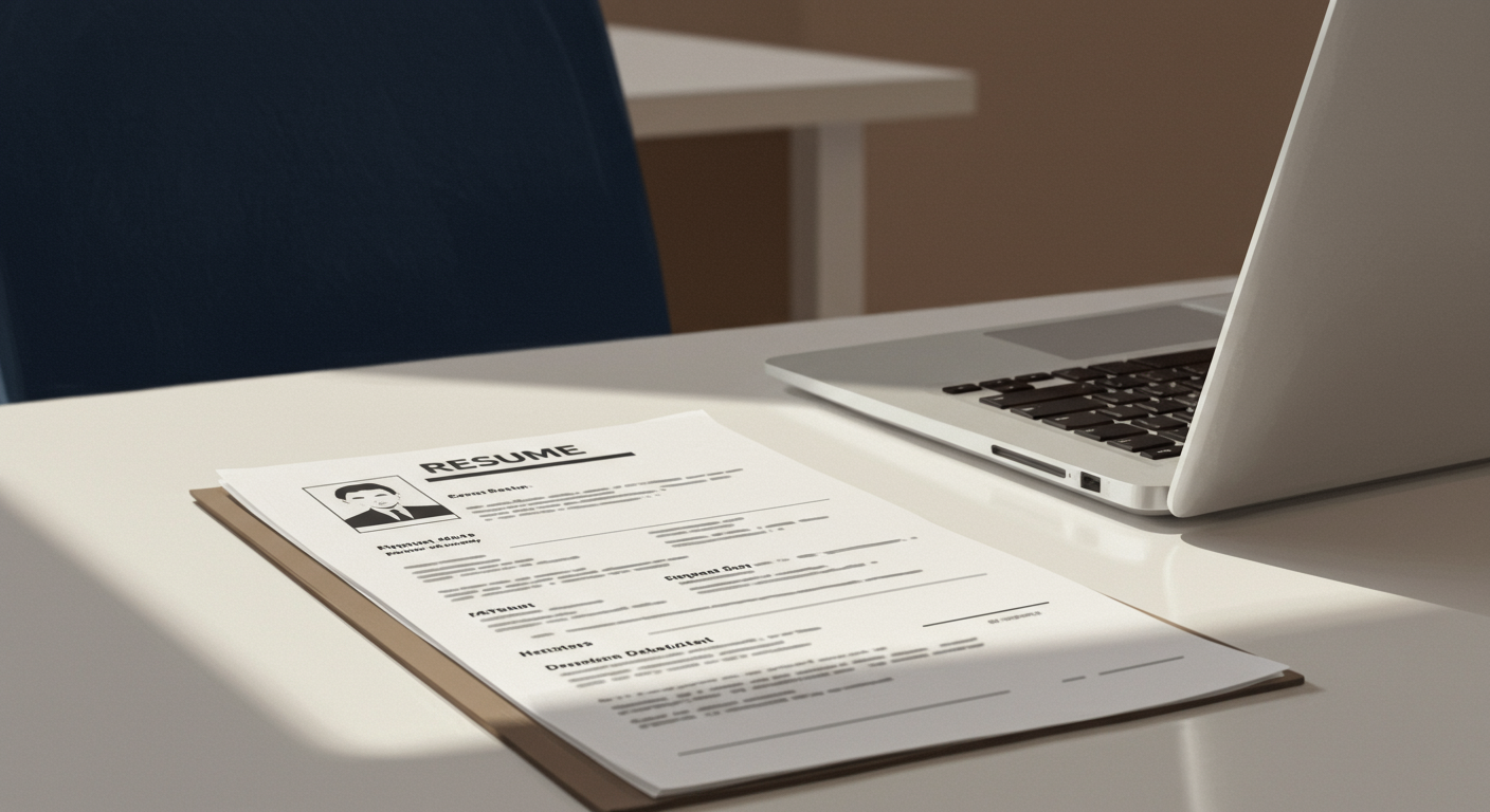
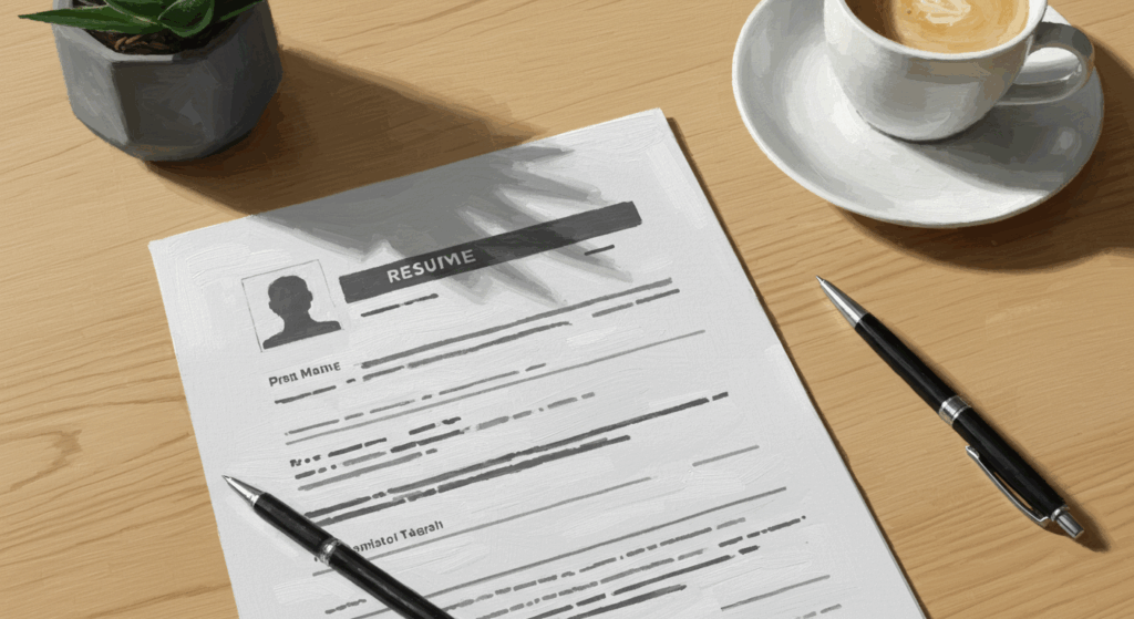
Ever spent ages choosing a resume template, only to think… “Why doesn’t it feel me?” Yeah, been there. Templates are starting points—tools to help you look sharp, organized, and read by both humans and bots. But the real magic? Your words, not some fancy colors.
Most modern job-sorting software (ATS, if you wanna sound smart) prefers clean, simple layouts—not fireworks. Templates labeled “ATS-friendly” exist because they help systems scan your info without choking. That means no text boxes, no awkward tables, no wild fonts. Just clarity.
2. ATS-friendly? Here’s what actually works
Okay—they say keep it simple. But what does that really mean?
- Use standard headings like Experience, Education, Skills—no fancy rename like “My Story” or “Experience-y Bits”.
- Stick to familiar fonts (think Arial, Calibri, Georgia) and normal margins (like 1”, or up to .65 on the tight side).
- Avoid images or columns. If you must use columns, test how it prints or converts to PDF.
Basically—clean, linear, easy to scan for both bots and tired recruiters.
3. Which template formats actually perform
There are classic resume structures that persist for a reason:
- Reverse-chronological: Your job history, newest first. Easy peasy, most recognized. Great for continuity and easily ATS-readable.
- Functional (skills-based): Highlight your abilities first; work history can follow later. Handy if you’ve got gaps or career pivots.
- Combination: Mixes the two. You get to highlight skills and show your career path. Nice if you’re switching fields or bringing in a good mix of both.
Pick the one that fits where you’re coming from and where you’re headed, not what impresses most visually.
4. Templates that “just work”… and why
Let’s be real—template design can make your spirit stand tall (or drag low). There’s value in matching the template to your vibe, but these types tend to actually land interviews:
- Simple/Classic Templates: Clean headings, balanced white space, minimal distractions. Great across industries—from corporate to creative—but safe.
- Modern Templates: Maybe a splash of color or a sidebar, but still streamlined. Works well for tech, startups, marketing gigs.
- Creative Templates: Use these only if your field actually values creativity—design, art direction, branding. If done right, they can double as your quick portfolio teaser.
And hey, customizable templates from sites built with recruiter input? Solid choices. They usually balance human taste with ATS-friendliness.
5. What really makes a template work (beyond design)
Here’s the deeper, quieter reason some templates land better:
- Easy customization—you don’t spend forever messing with layout.
- Organized hierarchy—recruiters see what matters quickly.
- ATS compliance—it gets scanned, not scrambled.
- Flexibility for tailoring—you can tweak for specific jobs without breaking the look.
So the “perfect” template? It’s one that’s easy for you to tweak, easy for bots to read, and easy for humans to digest.
6. What folks are saying (real Reddit nuggets)
“For an ATS friendly resume, I’d suggest keeping it simple… plain font, bullet points, clear titles… it finally got through.” That’s someone who ditched the bells and whistles and got real results.
Another chimed in: “Simple and elegant design… describes all the qualities… single page…” which speaks volumes—it doesn’t need to win awards, just communicate well.
Real people, real vibes. Simplicity wins.
7. Heat-tested templates you can try
While I’m not linking domains, here’s your friendly breakdown of kinda universal template styles:
| Vibe | What Works | Why It Works |
|---|---|---|
| Clean & Professional | Basic fonts, balanced layout | Works everywhere |
| Modern & Crisp | Subtle color accents, clear sections | Feels current without losing structure |
| Minimalist | Two-column, sans serif, streamlined flow | Great for skimming, trendy yet functional |
| Creative (use with caution) | Visual elements, bold headers | Good when field demands flair—otherwise risky |
Even freebies from office suites (Word, Docs) can do fine if formatted right—just check spacing, headings, etc.
8. How to actually tailor a template
- Start with your chosen template.
- Swap dummy text with your real stuff—don’t change the layout too much.
- Play with formatting—bold section titles, consistent spacing—just don’t break the structure.
- Test your resume—save as PDF, and Word if that’s acceptable.
- Run it through a resume scanner if you’re unsure if ATS can read it.
Templates are powerful, but your tweak is what breathes life into them.
9. More than looks—content still wins
Here’s the secret sauce—layout + content = magic. No templte will rescue missing achievements.
Focus on what counts:
- Super clean headings and sections you can scan without caffeine.
- Action verbs and quantifiable results (“increased customer retention by 30%”).
- A short highlight or summary is fine if it’s reflective of your strengths.
- Be selective—only put what’s relevant and recent. Templates don’t mean more is better.
10. Final note: Be yourself in there
Templates are like clothes—they give you shape, but your personality is still what shows. Don’t push wild design because you think it’s needed. If you’re in law? Stick to classic. If you’re in design? Feel free to experiment—just don’t let visuals confuse the story.
Even a resume that’s a tad imperfect but real, clear, and honest will beat a glossy layout with vague fluff every time.
So yeah. The best resume template is one that’s clean enough to get read, simple enough to tweak, and solid enough to support your real, human accomplishments.
If you wanna zoom into what creatives do vs backend folks, or how to tailor templates for specific industries, just say the word—I’ve got more scribbles ready.
Hope this helps you land that “You’re invited to intervew” ping, without losing your vibe in the process.

